Images are usually the heaviest part of a webpage. A site with fast CSS and clean code can still load slowly if the images haven’t been prepared properly. The good news is that image optimization doesn’t require complex tools or deep technical knowledge a few straightforward steps cover most of what matters.
This guide walks through compression basics, resizing, format choices, and a practical workflow you can follow before uploading any image to your site.
Why Images Slow Down Websites
Every image on a page is a separate file the browser has to download. The larger those files are, the longer the page takes to load. On a fast broadband connection, this might add a second or two. On mobile data which is how most people in India browse large unoptimized images can add several seconds, or cause parts of the page to visibly load in stages.
Page speed also affects search rankings. Google uses Core Web Vitals as part of its page experience signals, and image-heavy pages that load slowly tend to score poorly on LCP (Largest Contentful Paint) which is directly affected by how long the main image on a page takes to appear.
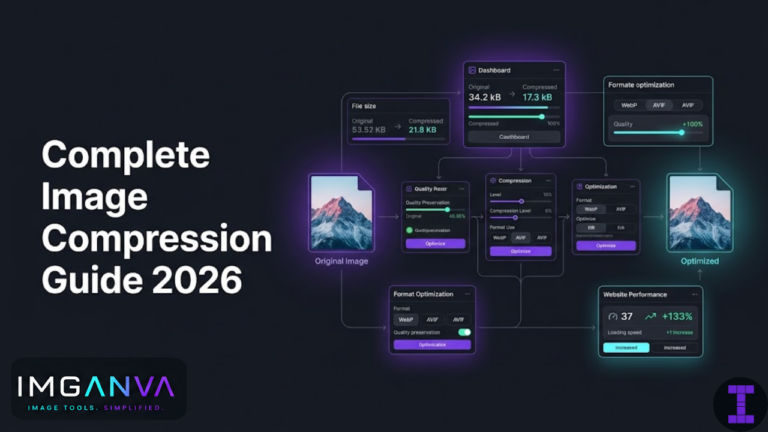
The three levers for image optimization are: compression, resizing, and format choice. Used together, they can reduce image file sizes by 60–80% without visible quality loss.
Compression Basics
Compression reduces file size by removing or encoding data more efficiently. There are two types:
Lossy compression
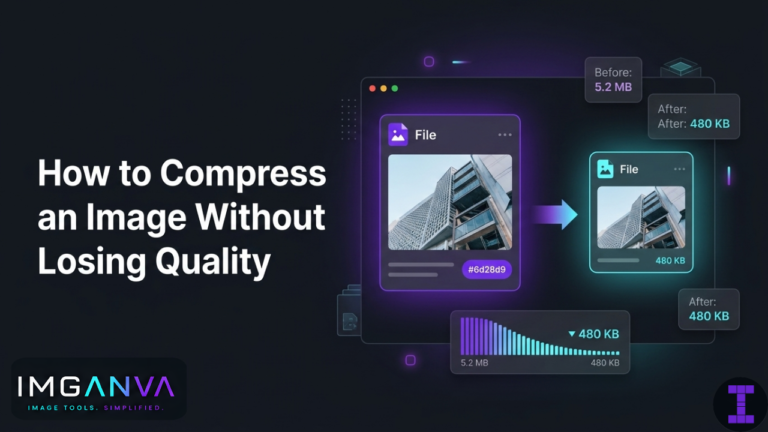
Permanently removes some image data to reduce size. JPG and WEBP both use lossy compression. At quality settings of 75–85%, the visual difference from the original is typically invisible to the eye, but the file can be 50–70% smaller. This is the standard approach for photographs and product images on websites.
Lossless compression
Reduces file size without discarding any data. PNG uses lossless compression. The file is smaller than the raw original but every pixel is preserved. Useful for logos, icons, and graphics where precision matters. The size reduction is smaller than lossy typically 10–30%.
For most website photos, lossy compression is what you want. Compress using Imganva’s Image Compressor upload the file, set the quality level, and download the smaller version. The tool shows output file size before you download, so you can adjust until you hit a target.
What quality setting to use
| Quality Setting | Best For | Typical Size Reduction |
|---|---|---|
| 85–90% | Hero images, large featured photos | 40–55% smaller than original |
| 75–80% | Product images, blog post images | 55–70% smaller |
| 65–75% | Thumbnails, background images | 65–75% smaller |
| Below 65% | Only when strict size limits apply | Visible quality reduction |
For most website images, 75–80% is a practical default. The file size drops substantially and the image looks the same on screen.
Resizing: Match Image Dimensions to Display Size
Compression alone won’t fix an image that’s oversized for its display context. If your blog post column is 800 pixels wide but you’re uploading a 3000-pixel-wide photo from your camera, the browser downloads all 3000 pixels and then scales it down visually. You’re paying the bandwidth cost of the full image without any benefit.
The rule is simple: resize images to approximately the dimensions at which they’ll be displayed, then compress.
| Image Use Case | Recommended Max Width | Notes |
|---|---|---|
| Full-width hero / banner | 1600–2000px | Used at large sizes; keep quality at 80–85% |
| Blog post / article images | 800–1200px | Match your content column width |
| Product images (e-commerce) | 800–1200px | Zoom features may need higher res |
| Card / grid thumbnails | 400–600px | Small display size; compress aggressively |
| Profile / avatar photos | 200–400px | Usually displayed very small |
| Sidebar / widget images | 300–500px | Keep small; they’re rarely the focus |
| Background images | 1200–1600px | Cover large areas but compress well |
If you’re uploading images taken on a modern phone (12–50MP), they’re typically 4000px wide or more. Resizing to the right width before compressing makes a dramatic difference you can go from a 6MB original to under 200KB without visible quality loss.
You can resize images quickly using Imganva’s Image Resizer. Set the target width (or both dimensions), download, then compress the resized version.
Format Choice: JPG, PNG, or WEBP?
The format you use affects both file size and compatibility. Here’s how to decide:
Use JPG for
- Photographs product shots, blog images, background photos, hero images
- Any image with complex color gradients
- Situations where broad compatibility matters most
Use PNG for
- Logos, icons, and graphics with transparent backgrounds
- Screenshots where text sharpness matters
- Images with flat colors and hard edges
Use WEBP for
- Everything above, when you want the smallest possible file size
- WEBP handles photos, graphics, and transparency all in one format
- All modern browsers support it Chrome, Firefox, Safari (2020+), Edge
WEBP typically produces files 25–35% smaller than JPG at equivalent quality, and smaller than PNG for graphics. For website use, it’s the most efficient format available without a significant compatibility risk.
If your images are currently in JPG or PNG, you can convert them to WEBP using Imganva’s Image Converter. On WordPress, plugins like Imagify, ShortPixel, or WebP Converter for Media handle the conversion and delivery automatically.
Quick format decision guide
| Image Type | Best Format | Fallback If Needed |
|---|---|---|
| Photo / hero image | WEBP | JPG |
| Logo with transparent background | WEBP or PNG | PNG |
| Screenshot / diagram | WEBP or PNG | PNG |
| Animated image | WEBP | GIF (larger) |
| Background texture / pattern | WEBP | JPG |
WEBP Considerations for WordPress and CMS Sites
If you’re running WordPress, the platform handles images through the media library. A few things worth knowing:
- WordPress 5.8+ can display WEBP images natively you can upload WEBP files directly to the media library.
- Automatic conversion is handled by plugins. Tools like Imagify or ShortPixel convert your uploaded JPGs and PNGs to WEBP and serve them automatically to supported browsers with JPG/PNG fallbacks for older ones.
- Manual upload approach: Convert images to WEBP using Imganva before uploading, then upload the WEBP file directly. Simpler, no plugin needed but requires manual work per image.
- Theme compatibility: Most modern themes handle WEBP fine. If you’re on a very old theme, test a few images to confirm they display correctly.
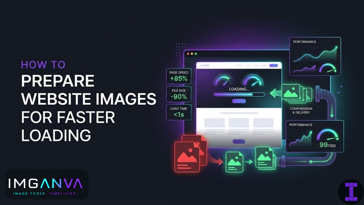
Other Factors That Affect Image Loading Speed
Compression, resizing, and format handle the bulk of it. A few other things also matter:
Lazy loading
Lazy loading delays image loading until the user scrolls near them. Images below the fold don’t load until needed, reducing initial page load time. In HTML, this is as simple as adding loading="lazy" to your <img> tags. WordPress and most page builders support this natively now.
Responsive images
Serving different image sizes to different screen sizes prevents mobile users from downloading a desktop-sized image. The HTML srcset attribute lets you specify multiple versions. Most modern CMS platforms generate responsive image sizes automatically.
CDN delivery
A Content Delivery Network serves your images from servers geographically closer to visitors. For an Indian audience, a CDN with edge servers in India reduces latency compared to serving from a server abroad. Cloudflare, BunnyCDN, and AWS CloudFront all have Indian presence.
Avoid unnecessary images
The fastest image is no image. Decorative elements that add weight without adding meaning stock photos used as section fillers, redundant background images, large illustrations nobody focuses on are worth reconsidering. CSS can handle many visual effects that previously required images.
Pre-Upload Workflow Checklist
Before uploading any image to your website, run through this:
- Check the display size How wide will this image actually appear on the page? Set that as your target width.
- Resize if needed If the source image is significantly wider than the display size, resize it first.
- Choose the right format Photo? JPG or WEBP. Transparent background? PNG or WEBP. Converting everything? WEBP.
- Compress Aim for 75–85% quality for photos. Check the output file size against a reasonable target (under 200KB for most page images, under 100KB for thumbnails).
- Check visually Open the compressed version at full size. If it looks fine, it’s ready. If you see visible artifacts, increase quality slightly.
- Name the file descriptively Use a clear, relevant filename (e.g.
blue-running-shoes-side-view.jpgnotIMG_4832.jpg). This helps with image SEO. - Add alt text on upload Alt text describes the image for screen readers and search engines. Write a short, accurate description.
Realistic File Size Targets for Website Images
| Image Type | Target File Size | Format Recommendation |
|---|---|---|
| Hero / banner image (full width) | 150–300KB | WEBP or JPG |
| Blog post feature image | 80–150KB | WEBP or JPG |
| Product image | 80–200KB | WEBP or JPG |
| Thumbnail / card image | 20–60KB | WEBP or JPG |
| Logo (with transparency) | 5–30KB | WEBP or PNG |
| Icon / small graphic | 2–15KB | WEBP, PNG, or SVG |
| Background texture / pattern | 30–100KB | WEBP or JPG |
These are practical targets, not hard rules. A complex hero image at 350KB is still fine. The goal is avoiding the common case of a 2–5MB photo uploaded straight from a phone with no optimization at all.
How to Check If Your Images Are Slowing Your Site
A few tools that show you where images are hurting page speed:
- Google PageSpeed Insights (pagespeed.web.dev) shows which images are oversized and estimates potential savings
- GTmetrix breaks down image issues including oversized dimensions and missing compression
- Chrome DevTools Network tab filter by “Img” to see exactly which images load, their file sizes, and how long each takes
PageSpeed Insights specifically flags “Properly size images,” “Serve images in next-gen formats,” and “Efficiently encode images” as separate audit items. If any of those show up with red or orange warnings, image optimization should be a priority.
Frequently Asked Questions
- How do I optimize images for website speed?
- Resize to display dimensions, compress to 75–85% quality, and use WEBP where possible. Together these typically reduce file sizes by 60–80% without visible quality loss.
- What is the best image format for a website?
- WEBP. Smaller than JPG and PNG at equivalent quality, supports transparency, and works in all modern browsers. Use JPG as a fallback if needed.
- What size should website images be?
- Hero images: 1600–2000px wide. Blog post images: 800–1200px. Thumbnails: 400–600px. File size targets: under 200KB for most page images, under 100KB for thumbnails.
- Does image optimization affect SEO?
- Yes. Faster image loading improves Core Web Vitals scores particularly LCP which is a Google page experience signal. Descriptive filenames and alt text also help with image search visibility.
- Should I compress before or after resizing?
- Resize first, then compress. This gives cleaner results and avoids compressing data that gets thrown away during resizing anyway.
- How much can optimization reduce file size?
- Realistically 60–80% when combining resizing and compression. A 4MB phone photo can become 100–200KB without looking any different on screen.
- Do I need a plugin to use WEBP on WordPress?
- No. WordPress 5.8+ accepts WEBP uploads directly. Convert before uploading using Imganva’s converter, or use a plugin to automate it across your whole library.
Summary
Image optimization comes down to three decisions made before you hit upload: right dimensions, right compression, right format. Get those three right and most pages will load noticeably faster with no visible change to how images look.
Start with the images that appear above the fold hero images, feature photos, anything that loads immediately. Those have the biggest impact on perceived load time. Work down from there.
For compression, Imganva’s compressor lets you see the output size before downloading, which makes hitting a target straightforward without guesswork.